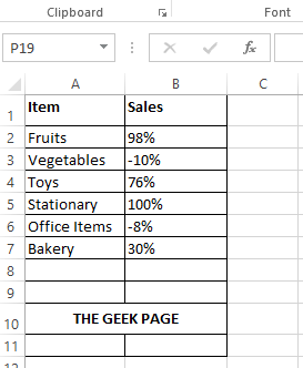
Let’s say you have the following simple Excel table that gives the sales profit percentage. A loss is indicated by a negative sign and a profit is indicated by no negative sign. Though the table is self-explanatory, sometimes, other users might find this representation a bit clumsy. The Sales column has negative and positive values and percentage signs. It definitely doesn’t provide the users with a visually appealing presentation of data.
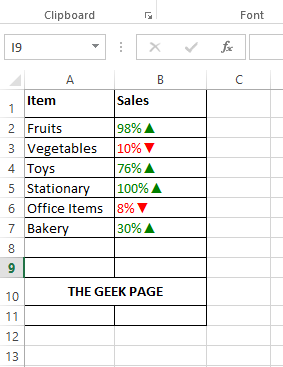
So, is there a way to make this Excel table more appealing like maybe the one in the following screenshot? In the following table, we have made the negative values red in color and the positive values green in color. We also have added a red down triangle and a green up triangle against negative and positive values respectively, to make the data more appealing and comprehensible. Ok, we get it that you are dying to find out how this can be made possible. Well, congrats on being at the right place. Happy reading!
Solution
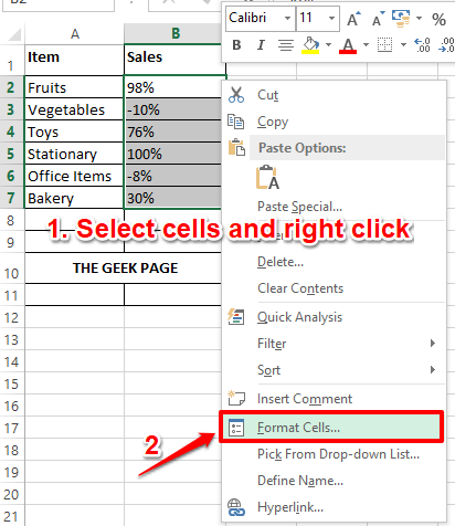
Step 1: Firstly, select the cells that you want to format with color icons. You can do this by dragging and selecting the cells, or you can simply select the first cell and then press the keys CTRL + SHIFT + Down Arrow together to select all the cells underneath the selected cell.
Once the cells are selected, right click anywhere on the selected group of cells and then click on the Format Cells option.
Step 2: On the Format Cells window, click on the Number tab at the very left first.
As next, from the list of Category options, click on the last one, which is, Custom.
Now, on the right side of the window, under the Type field, let’s type in the formula that would instruct Excel to replace the text color of positive values with dark green color and negative values with red color. We are also going to add a down or an up triangle as well to indicate loss or profit. Copy and paste the following formula in the Type field.
[Color10]0%▲;[Red]0%▼
You might be wondering how you can type in the up arrow and down arrow. Well, one way to do this is by simply copying and pasting the above formula. Another way would be to type them. To insert the up triangle, press the keys ALT + 30 together. To insert the down triangle, press the keys ALT + 31 together.
Note: Color10 indicates dark green color.
Hit the OK button once you are all done.
Step 3: There you are! Your Excel sheet now has the punch that you always wanted. Welcome to the club!
Please note that you can apply the same logic in any columns other than the percentage columns as well.
Do tell us in the comments section whether you found the article useful or not. Stay tuned for more amazing and super cool tricks, tips, and how-to articles.


